Simpler and easier on-boarding helps boost growth and overall revenue 🚀
Beam’s rider app experienced a 10% drop-off rate during the sign-up process. This case study offers an in-depth look at the strategic efforts and the innovative measures taken to enhance the sign-up and onboarding process, aiming to significantly improve user retention and satisfaction.


Beam - Turning little drives into better rides, and make cities flow better for everyone 🛴
Beam is the Asia Pacific region's largest micro-mobility company, offering e-scooters, e-bikes, and e-mopeds across eight countries: South Korea, Malaysia, Australia, New Zealand, Thailand, Indonesia, Japan, and Türkiye. With operations spanning over 60 cities, Beam boasts an impressive daily average of approximately 125,000 rides, supported by a fleet of more than 67,000 vehicles. South Korea is the largest market, with over 75,000 daily trips. However, in early 2022, daily trips began to decline, accompanied by a significant reduction in user engagement on our consumer app, leading to an overall decrease in revenue.
Problem Statement

Approach
As the Head of Product Design at Beam, I was keen to dive deeper and understand the reasons behind the business slowdown and unhappy users. I put together a strategy document to align with the approach, execution, and goal.


My Role
🪆 Define Strategy + 🔬 Conduct Research
🎯 Develop product vision and journey maps
🌈 Design wireframes along with UI Design
Duration
🗓 Sep 2022 - Jan 2023
Team
🎎 3 Designers, 1 Product Manager,
8-10 Engineers
We conducted extensive user research in a short time frame, employing various methodologies to gather valuable insights through primary and secondary research:

User interviews in South Korea 🎙️
We interviewed both new and regular riders to understand their frustrations with the product and its services. The result was a comprehensive user journey map, which helped uncover what a user experiences (both positive and negative) at different stages in the app, from discovery to sign-up and onboarding, to successfully taking their first trip.
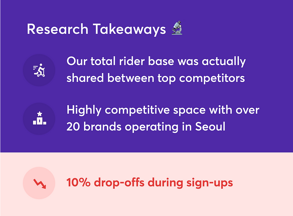
Competitor Analysis 🚴🏽♀️
We traveled to multiple cities and countries like South Korea, Malaysia and Indonesia, to deepen our understanding and experience our competitors’ offerings. This included both app based and on-road experiences, riding various vehicles from seated scooters to three-wheeled rides, providing us with a thorough understanding of their strengths and weaknesses.
Our research helped us identify key issues and user frustrations, particularly in the sign-up flow, which was time-consuming and frustrating. We went deeper into the sign-up flow to understand the critical changes that needed to be done and worked closely with the product managers and engineers to ensure our proposals were feasible under strict timelines. It was imperative to bring new flavours and also provide a cohesive user experience.
The sign-up flow was time consuming and frustrating. Some of the issues have been detailed out below:
Key issues: Sign-up + On-boarding flow
⛔️ Lack of storytelling
When the user downloaded and opened the app, they were immediately prompted to enter their phone number, which felt abrupt. It’s almost like meeting someone for the first time and asking for their phone number before catching their name!

⛔️ Absence of alternative sign-up methods
The only sign-up method available was via phone number with OTP verification. And, if the entered OTP was incorrect, the user had to retry, potentially making the entire sign-up process take up to two minutes. For a service designed for short and quick rides, this lengthy sign-up process proved frustrating, leading to a 10% drop-off rate.
⛔️ Country specific age verifications
In South Korea and Japan, riders must enter their driver's license details to verify their age. This extra step lead to user frustration and higher drop-off rates.
⛔️ Interstitials for city rules
The onboarding process includes around 5-8 city specific steps/ rules which was creating unnecessary noise. And sharing information contextually could streamline the experience.


Intuitive user journey 🍾
The current experience was clunky and inefficient leading to unhappy users. The goal of the redesign was to provide an intuitive in-app experience and make it easier for users to sign-up, find a vehicle, scan it and take a trip.
Beam provides services in over 60 cities across 8 countries. Every city has different rules and regulations that need to be followed. The architecture needed to be flexible enough to scale seamlessly across regions.
Scalable 🍱
Inclusive and Delightful 🍫
Storytelling and an inclusive interface was important as we were catering to a wide audience coming from multiple cultures.

I put together three guiding principles that helped all the designers stay aligned when exploring concepts while trying to answer the important "How might we make the sign-up experience simpler and faster?"


Simplifying the sign-up experience lead to an increase in conversion from 85% to 97% 🎉
🟣 Introducing Single Sign On (SSO)
The current experience was clunky and inefficient leading to unhappy users. The goal of the redesign was to provide an intuitive in-app experience and make it easier for users to sign-up, find a vehicle, scan it and take a trip.

💜 Simplified onboarding for faster app familiarization
Our research shows that users "future-proof" themselves by downloading the app well in advance of their trips. Previously, mandatory steps like "Adding payment details" and "Verifying their license" extended the sign-up process, frustrating users by delaying access to the homepage. In our new design, users can skip these steps, immediately access the home screen, and familiarize themselves with the app, riding instructions, and local rules. They can add payment and license information at their convenience before taking a ride.

SMS cost came down by 50% helping boost company revenue 🎉
💜 SSO vs Phone number experiment
We ran an experiment testing between sign-up via Single Sign On (SSO) and sign-up via Phone number (No SSO) in Malaysia, New Zealand and Türkiye. The results showed that almost 50% of the new sign-up were via SSO. With SSO implementation, users were now able to sign-up faster, and the company was also able to save money on SMS costs sent to new users for OTP verification went down. This also safeguards Beam against future frauds.


Thank you for reading 🤍
Surverys 🗳️
We distributed surveys across multiple countries to gather user feedback on Beam's rider experience. The surveys provided insights into users' perceptions of our offerings and highlighted the top reasons for preferring competitors over us.
App Audit📱
I performed a UX audit of our app to identify gaps in the rider experience and uncover opportunities for improvement. This audit was instrumental in pinpointing specific areas where our app could be enhanced to better meet user needs.